interior design

Tigertail Ridge, Brentwood: Architectural Interiors With Susan Jay Design

A few weeks ago, I wrapped a great project with the renowned Susan Jay Design in Los Angeles. On a ridge in Brentwood, with views overlooking Los Angeles' famous Getty Museum and Century City, this location was truly a stunner. Expansive views over all of LA, coupled with a fun yet restrained interior made this one of my favorite shoots of the year, despite the many challenges we faced. The home featured plenty of interesting architecture and angles, and while it is quite a sight for the eye, it can be particularly difficult to photograph. Faced with tight quarters and big windows which required a lot of light, we took nearly 12 hours to create just as many images.


Waiting for the right time of day is crucial - as fighting the sun through those big windows is just asking for trouble. We wanted the interior to appear soft, natural, and livable, so time of day was crucial to avoid harsh light and shadows interfering with our own light.

As has been repeated ad nauseum thorughout history, architectural photography is 90% moving furniture and 10% photography - and we did plenty of moving furniture on this shoot. Endless amounts of books were moved, couches tweaked, chairs tweaked, tables pulled out, and put back in - all to try and tame the color and shape that were present everywhere. With big windows comes busy backgrounds, and making everything work together seamlessly takes a bit of patience (with some good humor thrown in, of course).

This mid-century gem was a real treat to photograph, and added a few nice shots to my portfolio. With interesting lines, incredible furnishings and one of the best views in LA, there was no going wrong with this location.

Photographing Fig House: Los Angeles' Coolest New Event Space

It's true: I get to see some seriously cool locations. One of my favorites has to be the recently completed Fig House in Los Angeles. Located in Highland Park, Fig House touts itself as a bespoke events venue, catering to a wide range of clients; they do everything from weddings to corporate parties to photoshoots and everything in between. Fig House is exciting and fresh, and a definite change of pace from what I usually shoot. With an eclectic mix of styles (everything from 1920s Hollywood to art deco with modern LA touches) it was a nice challenge to capture it all. I absolutely loved all of the color and variation throughout the space. 


I opted to shoot this in a more natural light style - this place just came alive with color owing to the huge sliding glass door windows emblazoned with stained glass by Judson Studios. Since the design was full of color and a mix of styles, adding a ton of light wasn't going to do any favors: it would only make the scene busier. I'm all about lighting to the space - and what that space calls for in terms of photography in order to make it look the best that it can.  No need to reinvent the wheel if you don't have to, right?

Next door to Fig House is Roomforty, a catering and restaurant service with a charm all it's own. While this was merely an accesory to the Fig House shoot, I absolutely loved the decoration and design of the tasting room, where potential clients can get a taste of the food made right on site or friends can gather to have a private meal of their own during a function at Fig House. 


And of course, what blog post would be complete without mentioning the perks of being an architectural photograhper? Roomforty's food, as expected, was absolutely jaw-droppingly delicious.


Photographing a Modern Office Interior in Orange County: Ferm Design Concepts

Back in October, I had the pleasure of working with one of my favorite clients, Kelly Ferm of Ferm Design Concepts and 707 Circle Lane to photograph an office interior she designed for local Orange County startup InsuranceOnline.com. Shot over the course of just a few hours - we had to be quick in order to not interfere with the day-to-day operations of the business, which was full of workers running around and getting things done! 

The waiting room, below, lit with hot and strobe light brought out the softness in the wood and smoothly curved white armchairs. By adding shadow and highlight we were able to add plenty of depth and interest in a room lit with only overhead can fluorescents for practicals. I strive to take places like this - with interesting interior design, yet fairly standard overhead office lighting - and transform them into a soft, inviting, and flattering image that presents my clients' work better than any snapshot could.


Up next, a simple conference room and break room - but bringing softness and richness to the design is a bit tricky when dealing with just ovehead fluoros. The camera doesn't quite see what the eye does, so plenty of massaging with light is necessary. Those conference room windows were heavily tinted blue, and required some serious gelling of the lights to make it all match. 

And lastly, my favorite shot from the day, and a very impromptu one at that, shot as most of the workers were at lunch. I saw this angle upon walking in and wanted to shoot it, but pulling it off would be tough. We only had about 20 minutes or so to clean, organize, stage, and light the space, which of course was tricky. Working with an assistant, we hid everything we could, arrange the desks and computers as best as possible, had a few workers stand in for models to give some life and activity, threw a couple lights up, mostly in a seat-of-the-pants fashion, and let it ride. What resulted is one of my favorite shots in recent memory. Even a simple office interior can photograph incredibly well if the architecture lends itself to it. 


And this shot, as it turns out, lent itself to a very nice black and white conversion, which I find quite reminiscent of a few shots of Julius Shulman's. A classic, contrasty one point perspective which draws the eye in and lets you linger. Thanks, Kelly, for the great subject and chance to make some killer photos!


You'll have to excuse my lack of blogging lately, as I have been busier than ever and all over the west coast photographing (nearly 4,000 miles driven in the last two months alone) a number of different projects. Expect a lot more posts as this cools down and the holidays come up.


How To Photograph Real Estate, Interiors, And Architecture: Where Art Meets Architecture

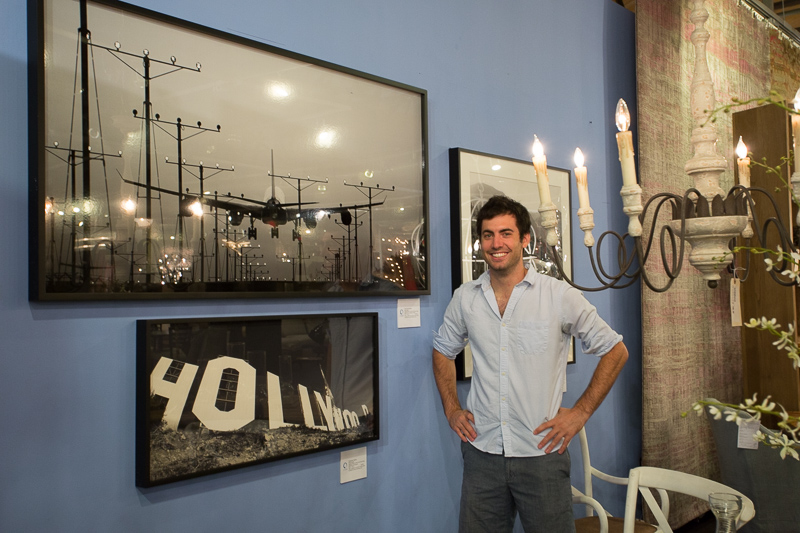
After over six months in production, I am happy to announce that my tutorial 'Where Art Meets Architecture: How To Photograph Real Estate, Architecture, and Interiors' is finally available! I partnered up with Fstoppers.com to create a comprehensive eight-hour tutorial which covers so many facets of architectural and interior shooting.  I wanted to give my readers and followers the first chance to purchase the tutorial, which is available for $299 (click here), before it goes open to the public, pending Fstoppers.com's migration to a new server this week.

I will explain each and every technique that I use to produce my photographs. The full photography tutorial is broken down into three chapters, each covering the tools necessary to succeed in the different niche markets within the field of interior photography. So no matter if you are an experienced photographer or have never taken your camera out of auto mode, I'll take you from shooting basic bedrooms all the way through my complicated light-painted exteriors. 

We've created a ten-minute trailer for the tutorial, which breaks down everything inside it and gives a brief look into my workflow, which can be seen here:


Here's what I cover throughout the tutorial:

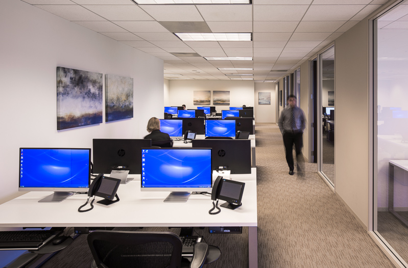
Real Estate Photography: In the Real Estate section, I take the time to teach you everything you need to know about this genre so you can kick start your career and start producing images for real estate agents, listing agents, and general property management. All of the basics will be covered in this chapter including:

  • How to get started with minimal gear
  • How to bounce flash effectively
  • Using natural light to your advantage
  • Properly composing your frame
  • Choosing the correct focal length
  • How to retain exterior window views
  • Two, three, and four light setups
  • Correcting pincushion and barrel distortion
  • Fixing converging lines in Photoshop
  • Creating a final image completely in camera

 
In addition to getting started, I'll also talk candidly about how I have found success in the real estate market, and how you too can build a money making business shooting properties for sale.

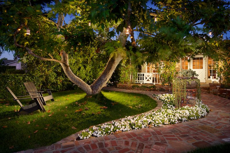
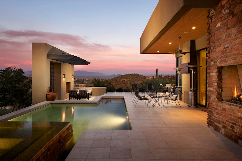
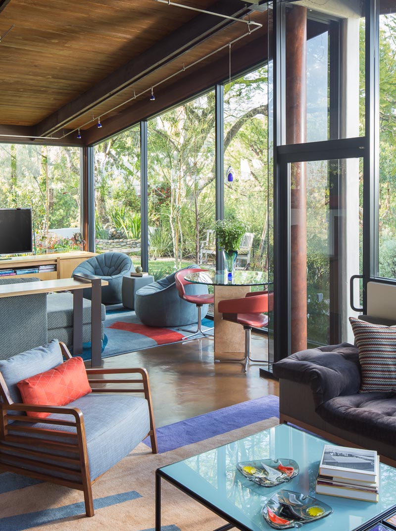
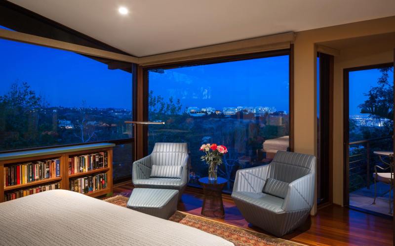
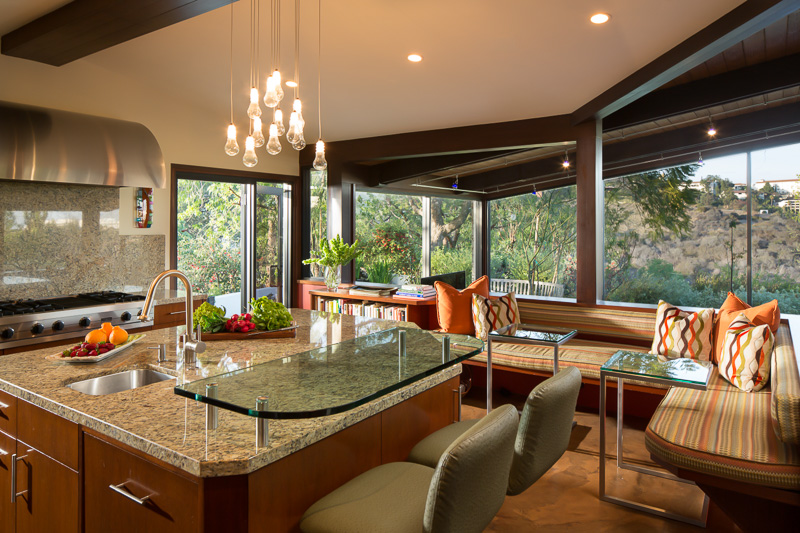
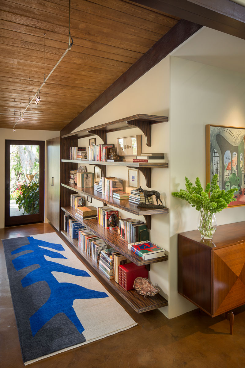
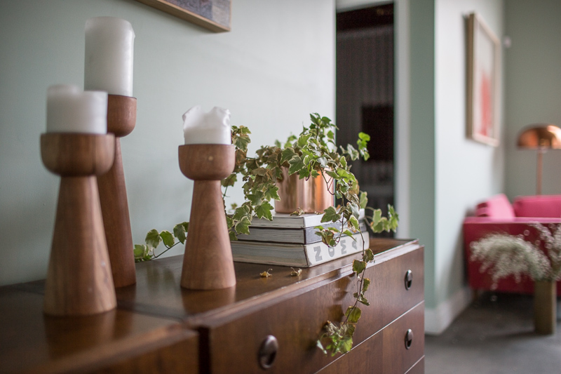
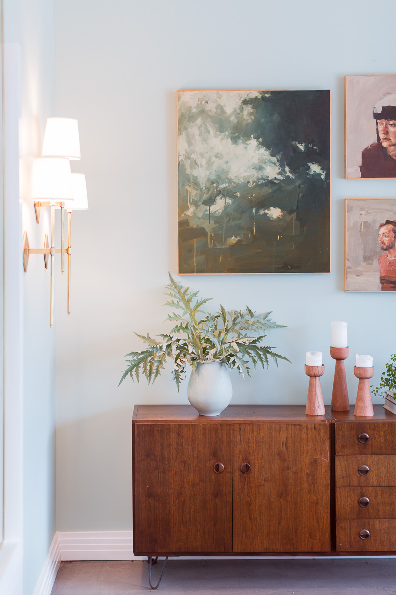
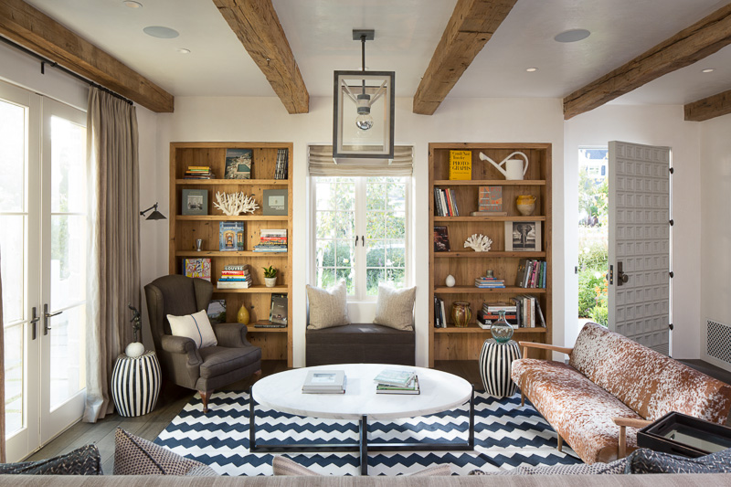
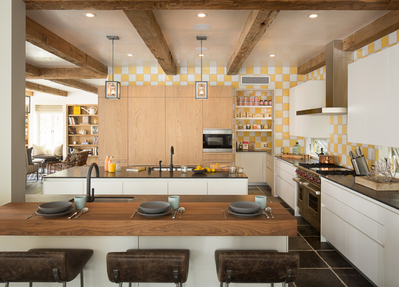
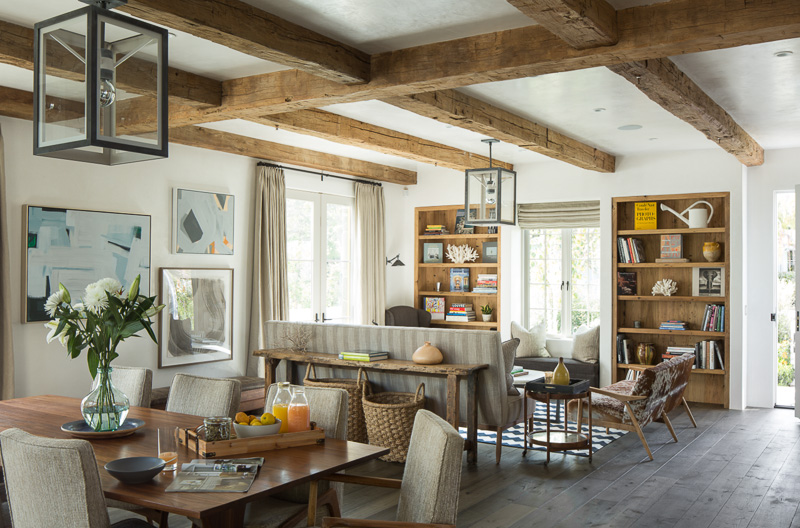
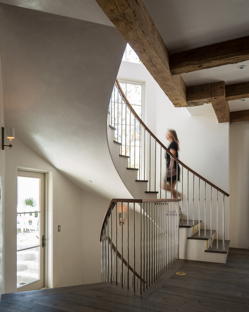
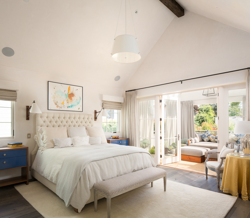
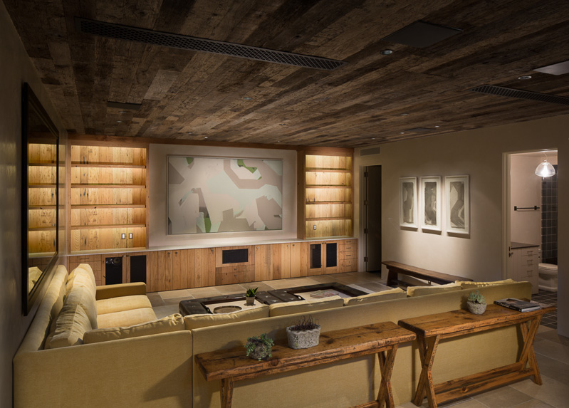
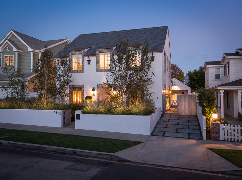
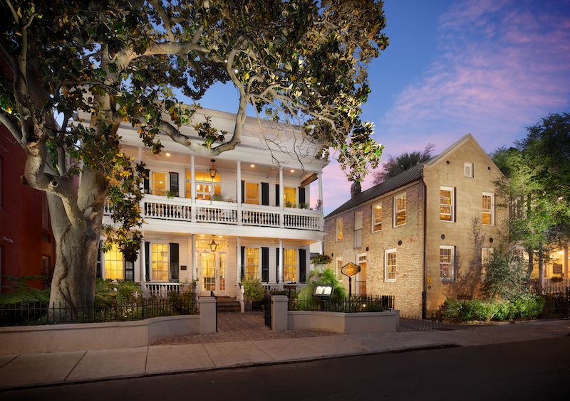
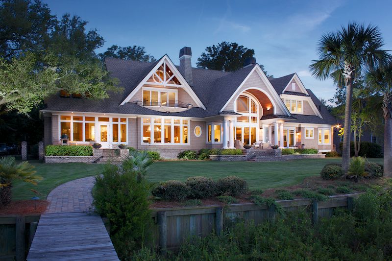
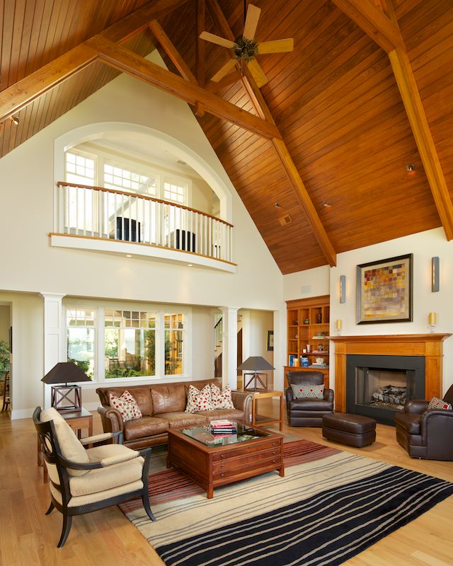
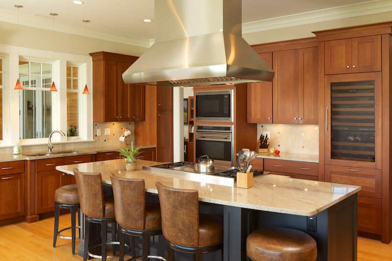
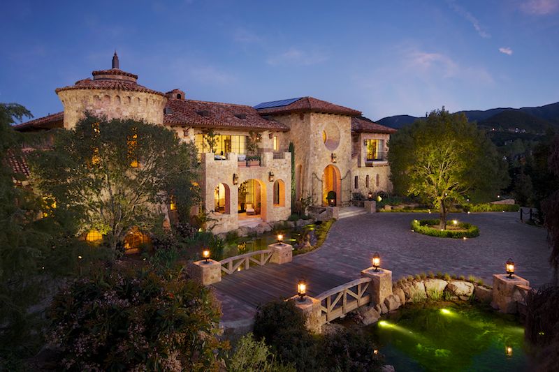
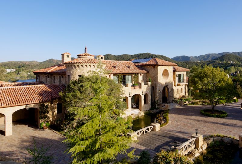
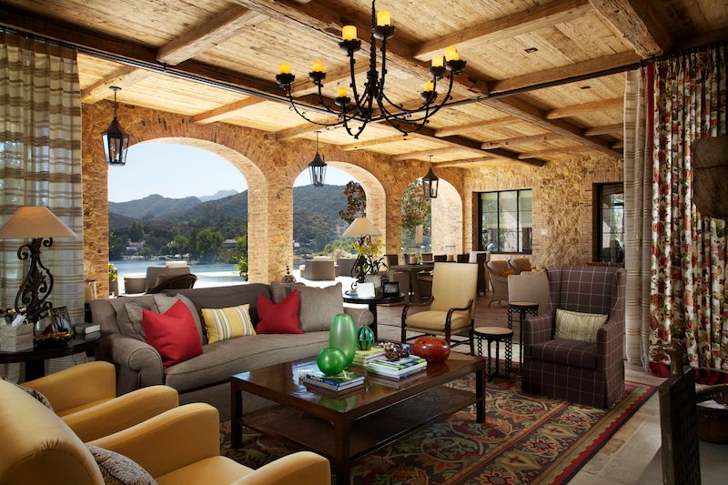
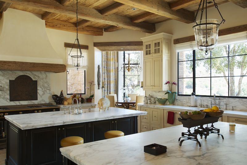
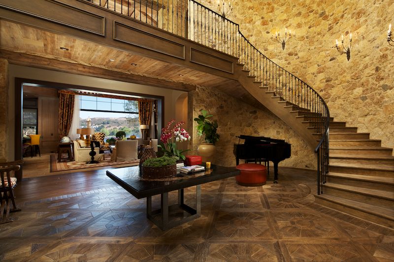
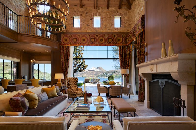
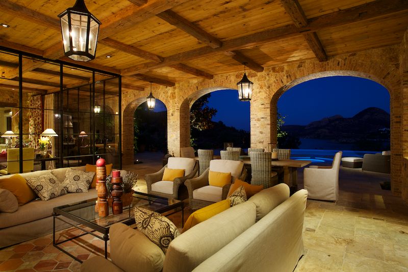
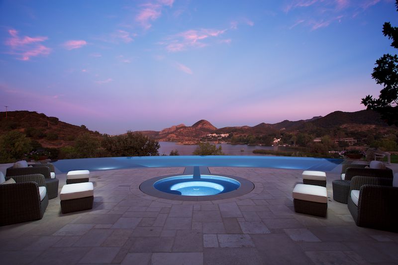
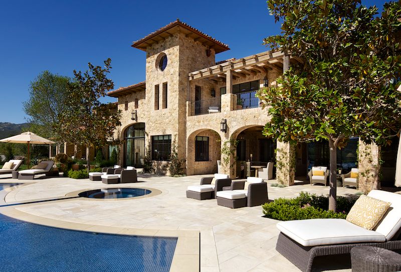
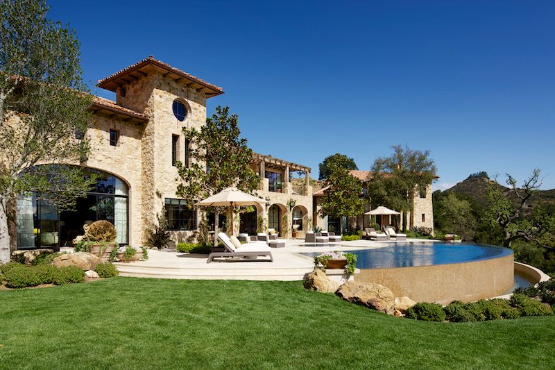
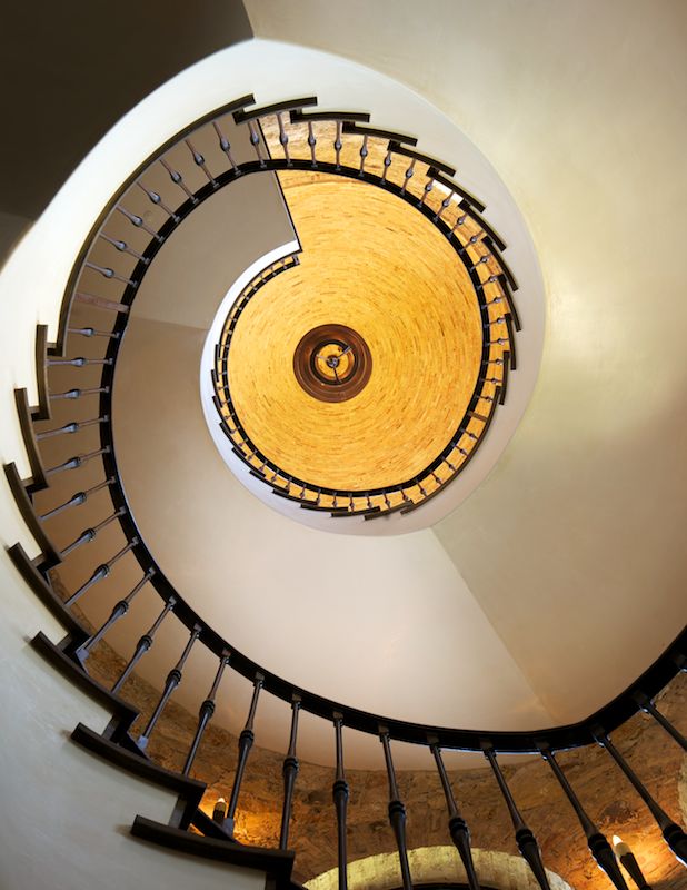
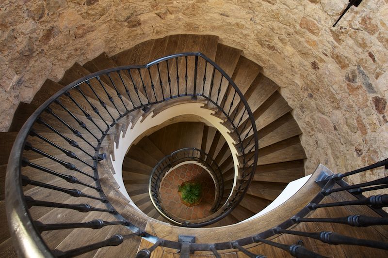
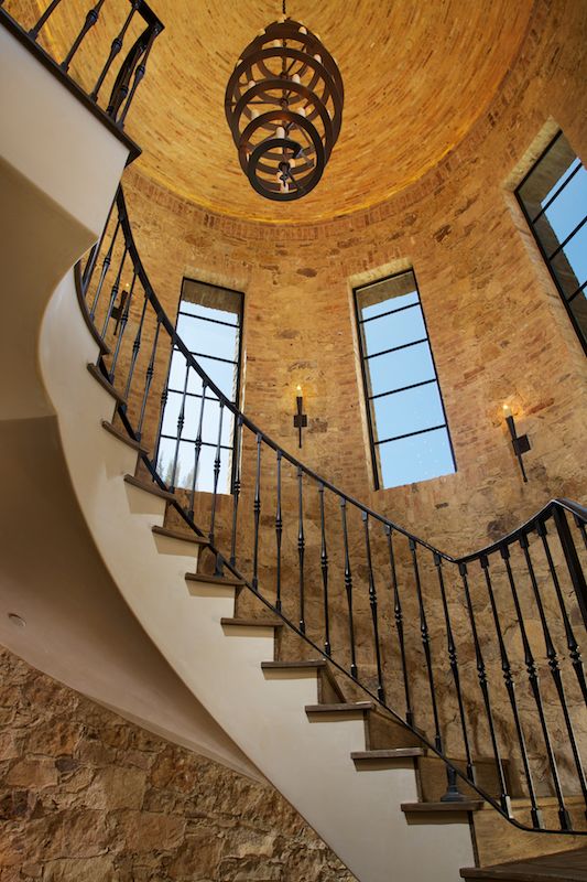
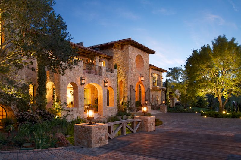
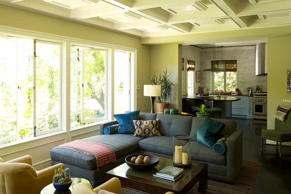
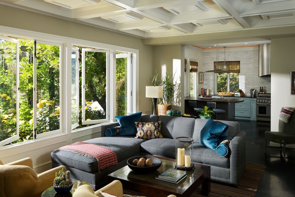
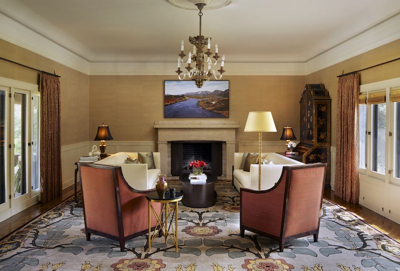
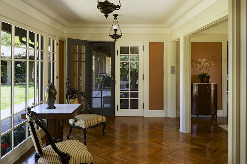
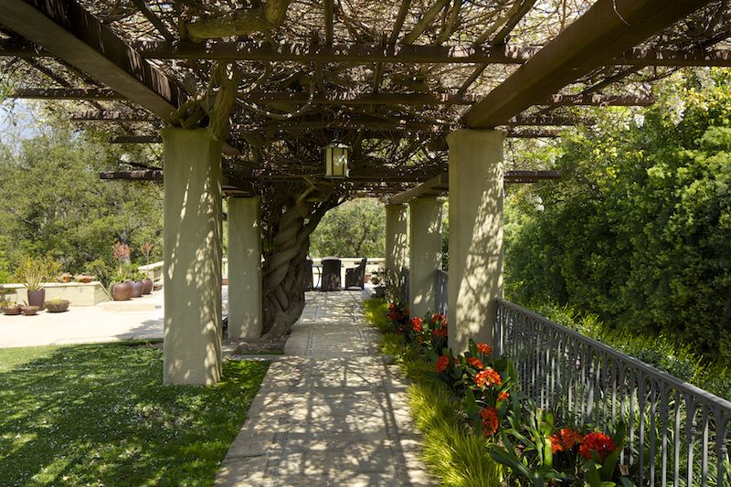
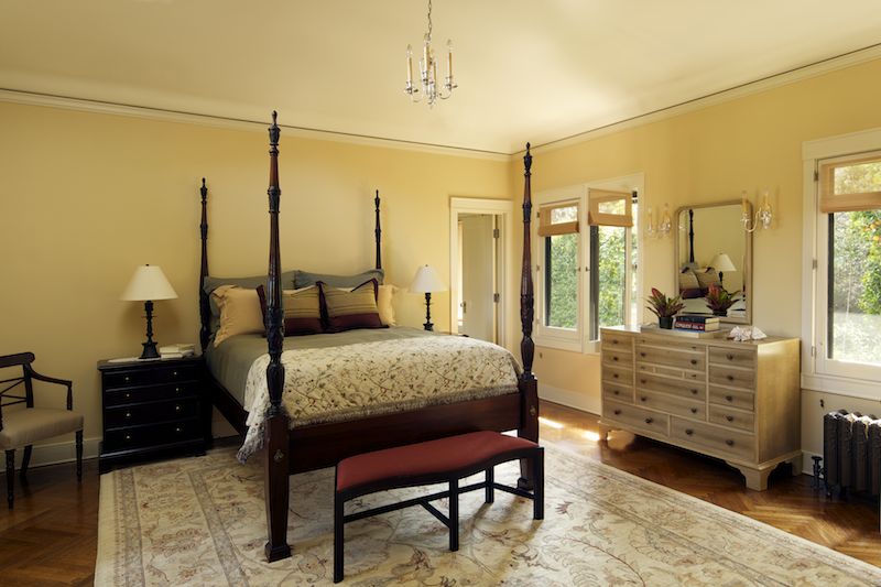
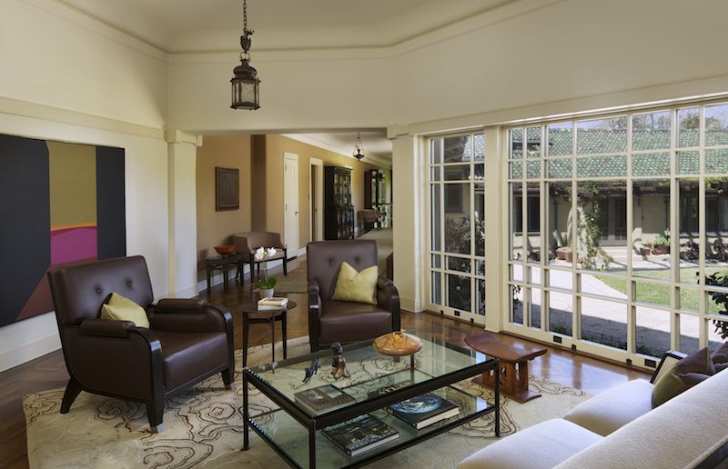
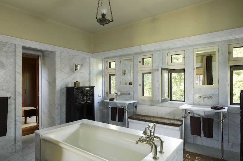
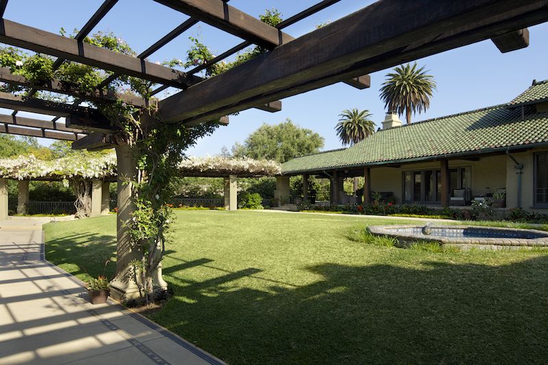
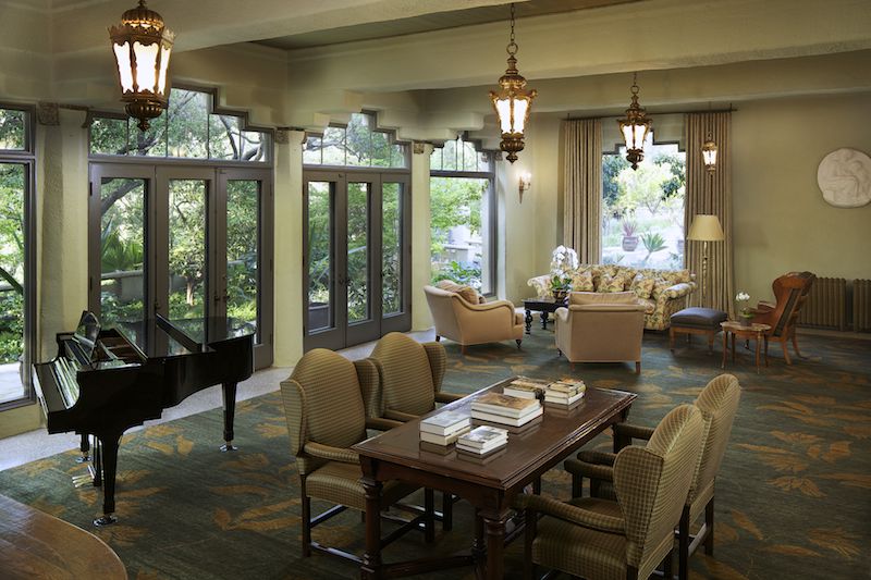
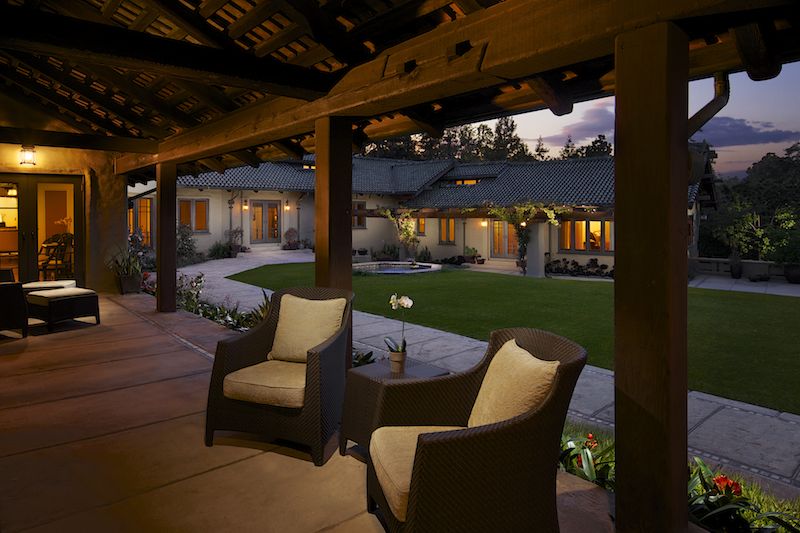
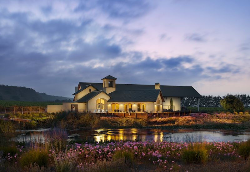
Architecture and Interior Photography: This chapter focuses on how to create photographs for higher paying clients like architects, home builders, interior designers, and magazine editorials. With the ground work already laid down, I will focus on streamlining your workflow and pushing your images into actual works of art. While on location at an actual architect’s personal home, I'll take you step-by-step through eight flagship images from initial capture all the way through the final photoshop editing process. We have also included a full Photoshop PSD file of a twilight exterior images so you can follow along as we go through photoshop.

  • Twilight Exterior Technique
  • Advanced light painting and compositing
  • Tethering to an ipad/iphone
  • Using scrims  and flags to control reflections/specular highlights
  • The “Moody Interior Twilight Shot”
  • Faking warm sunlight
  • Staging furniture for strong compositions
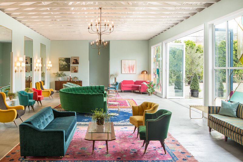
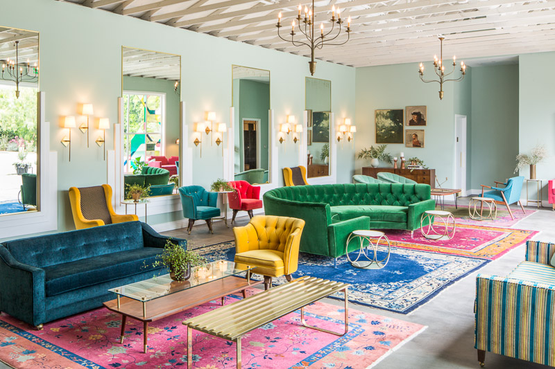
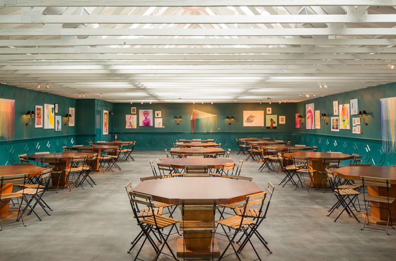
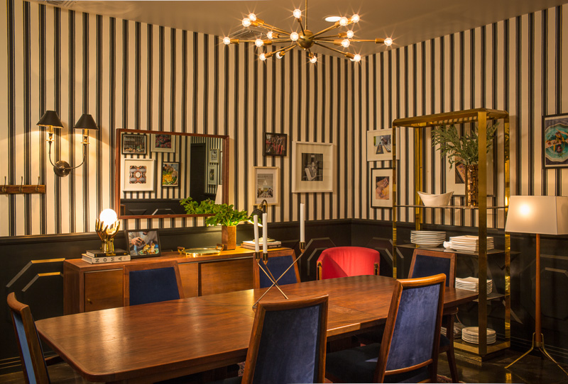
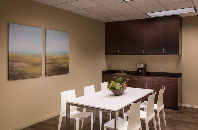
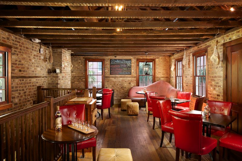
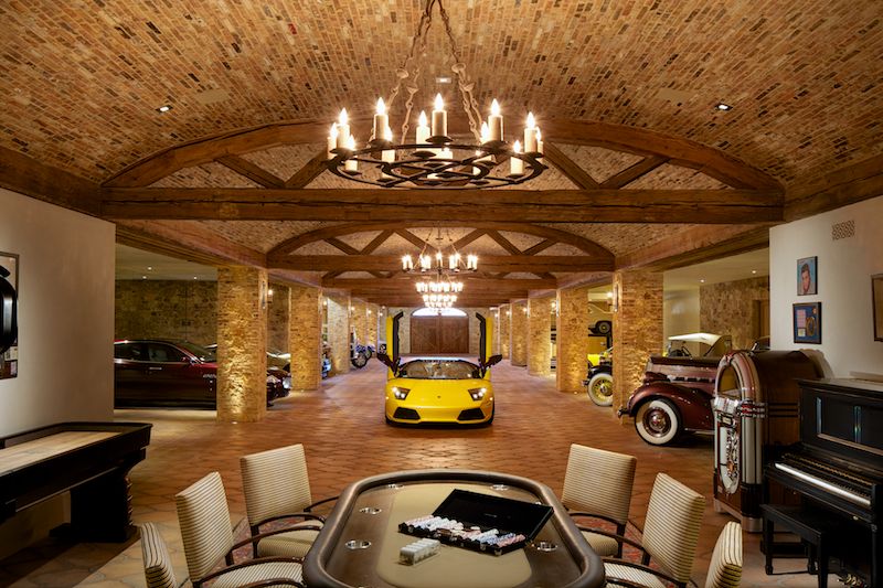
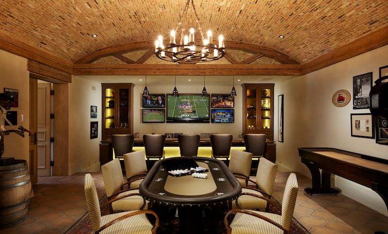

Commercial and Advertising Photography
: In this final section, I'll take you on the set of two commercial spaces and demonstrate how to produce perfect images for restaurants, hotels, wedding venues, resorts, and other commercial clients. Emphasis will be placed on meeting your clients needs and lighting images according to the use of the space.

  • Creating twilight images while a restaurant is open for business
  • Incorporating people into your photography
  • Lighting multi room locations
  • Replacing details in Photoshop
  • Lighting large banquet halls
  • How to create an inviting atmosphere

 
In addition, I also touch on commercial project pricing, licensing, and dealing with clients in a way that keeps everyone happy and creative energy high.

If you are interested in purchasing the DVD, you can click here, which will take you to our e-junkie store, where it is available for $299, which in my opinion is a great value. I have watched it a few times and every time I watch it I think about what a steal it is! It took me years to figure all of this out and to hone my craft to the point that its at today. Unfortunately, my partner, Fstoppers.com has been absolutely slammed with traffic from a few of our posts that went viral, which we are working on getting fixed right now, and I am releasing this to just my loyal followers until it goes public at the end of the week.

I hope you like what you see - we've gotten a handful of glowingly positive reviews from watchers, which is great to see after all of the work that went into it. If you have any questions at all, feel free to shoot me an email or reply to this post and I'll get back to you!


Belgian Country Style Interior And Architecture in Pacific Palisades, CA

About a month ago we wrapped up photographing an amazing home in Pacific Palisades, one of Los Angeles' hidden and lesser-known neighborhoods. This home was all about the stories: from the reclaimed wood in the ceilings and floors, to the tiles that were imported from France and originally made in the 15th century, the house just exuded an incredible charm everywhere you looked. 

Shot over the course of two days, we created a series of about 10 staged and lit photographs and a number of portraits of the builder. This was without question one of my favorite homes that I've ever photographed - wherever you looked there was something worth shooting. There was no expense spared, and the home was an example of how incredible something can be when no corners are cut. 

The kitchen, designed and built by Bulthaup, is simply magnificent. The exposed wooden trusses in the ceiling are reclaimed and hundreds of years old, and juxtaposed with the modern and sleek lines create for a strikingly symmetric yet inviting space. Capturing this was tricky, as the powder-coated beam in the center of the home proved tricky to work around. However, that beam itself is a work of art - as it is this one column that supports the weight of the entire home. The entire downstairs is an open layout and flows seamlessly from space to space, something that's tricky to capture. In order to pull it off, we had to compose and light very carefully.


I may sound like a broken record here, but we were just awed by this home. The staircase, seen below, was entirely floating and not attached to any wall sans the outer radius. It was quite an engineering feat to pull off- and we worked hard to capture both the engineering and mood of this area. My stylist, Dana, who will be getting her own write up soon, stood in as a model for us, too.

The upstairs was quaint yet airy and light. Vaulted ceilings and an indoor-outdoor bedroom let the outside in effortlessly, though capturing it proved difficult. With such a difference in exposure between the ambient exterior light and interior light level, we had to find a way to balance both yet attain a natural and airy feel. With nowhere outside to put lights, I opted to composite this photograph which resulted in the perfect feel.

Lastly, a killer basement theatre was installed with - yet - again - reclaimed wood and tile throughout. Everywhere you turn in this house there's a story, from centuries-old reclaimed wood to tiles dating from the Napoleonic era of France, it was a pleasure to be allowed into this home for as long as we were and to take our time capturing all of the details and spaces throughout.

We've submitted this project to a number of shelter magazines, so hopefully in the coming months we'll have a few nice tearsheets to share. Till then...fingers crossed!

Mpkelley.com Now In Stock at HD Buttercup!

Some of my fine art prints have been made available at HD Buttercup, a showroom for all things interior design, located in Los Angeles and San Francisco. For those who don't know, I also partake in quite a bit of attempted fine art photography forays, some of which can be seen here. It's been awhile in the making but I've finally been picked up by a big store like this and I'm so excited to see where it goes. 

So, fingers crossed here, that this awesome piece mounted with plexi and an amazing frame makes a few sales soon. It's great to see something that I'm passionate about finally start making a bit of money for me. Seems like all those one-off trips to the end of the runway at LAX are starting to pay off.


Upcoming Architectural Photography Tutorial DVD And Workshops With Fstoppers.com

Over the past few months, I've been scheming with Lee Morris and Patrick Hall of fstoppers.com to bring our combined talents together and produce a DVD/tutorial series on the subject of architectural photography. So in May and June of this year, I once again left Los Angeles and headed to Charleston, SC to begin production on the largest project I've been involved in to date. Working with local advertising agencies, we set up a series of shoots for varying clients all over the Charleston area and we were lucky enough to get them to allow us to film everything that went on. 

This is, for the most part, an entirely comprehensive tutorial. While it would be pretty impossible to teach EVERY single method of architectural photography, we did our best to cover the basics all the way through the more advanced techniques. We've got a chapter on shooting real estate and getting things right in the camera, for those who are just starting out with minimal gear. We've got a chapter shooting a home for one of Charleston's most well-known architects, where we dive into topics such as using natural light, staging a room, using scrims and subtractive lighting, light painting, and photoshop techniques to bring it all together. We've got a chapter dealing with commercial photography for restaurant interiors, as well as creating moody light painted scenes and controlling light from multiple sources to ensure that you can create a repeatable result in pretty much any situation that could ever arise. We got to shoot at some of Charleston's (and the country's) best restaurants - such as Husk, which has been voted the best new restaurant in America and has featured on many TV segments in the past few years. Very, very exciting stuff! 

Each image in the tutorial was designed to teach a technique, so keep that in mind while viewing. We wanted to show you a myriad of options for creating your own awesome architectural images, so we really pulled out all the stops and went to down wherever possible. Even if we didn't need to do it for a certain image, we included the technique anyway, just to give you as many options as possible for soliving problems that you'll face on any given architectural or interior shoot.

And here's the most exciting part of all of this. We've decided to release one of the shots - a dusk light painted exterior - with the DVD. That means you'll get the PSD files and you'll be able to follow right along as I edit the file in the tutorial. You'll be able to create an image exactly as I am, folllowing my every move - learning my techniques exactly in the method that I use them. No stone will be left unturned, as I wanted this to be an entirely comprehensive tutorial. 


Above, I've included a few of the images that we're going to walk you through step-by-step. All told, we shot over 20 images and it looks like at least fifteen of them are going to make it into the final cut. Each of them teaches a different technique - from light painting, to dealing with tricky color casts, to adding artificial light through windows, fixing pesky window views and ensuring that you can see whatever you want to see out a window, balancing light at different times of day, and so on and so forth. I'm really, really excited about this project, and I can't wait to see it released. 

As of right now, we're planning for a fall 2013 release; definitely before the new year. Keep your eyes peeled for more details, which I'll release as we get closer to completion. We've also got a number of promotional videos in the works that I'll post and share, as well!

More to come...looking forward to it all! 

Photographing The Robb Report 2013 Ultimate Home

About a year ago, I was contacted by a few potential clients who wanted to get together and discuss the possibility of shooting a home still under construction. Of course - it sounded like any run of the mill project and the meeting would be a simple brainstorming session of ideas, finding out what angles and features to shoot, and figuring out the optimal time of day(s) to shoot the home. 

I was incredibly surprised when I drove up to the location and first laid my eyes on the home that we would be shooting. A 26,000 square foot, completely custom Italian/Tuscan villa that sat on top of its own private hill with gated access points and what could best be described as castle walls all around. Simply incredible! I've seent a lot of homes and it takes quite a bit to get a big reaction out of me, but this was unlike anything I'd ever seen. The detail and finish work were exquisite. For example, each of the coppi tiles on the roof were salvaged from Italy, and they were hand made hundreds of years ago by artisans who formed them by pressing them over their legs. 

No expense was spared inside, either. The kitchen featured a custom La Cornue range, and the home sported an 8,000 square foot subterranean garage to keep the homeowner's collection in order. Lamborghinis, Ferraris, Teslas, Bentleys, the list goes on, it was all here. There were even a few lifts so that the owner could work on his own cars if he desired. 

Many of the furnishings and finishings were imported from Europe by the owners when they went on shopping trips, and original old-world artwork adorned the walls. A custom movie theatre with a glass floor looking onto the garage below was a rather interesting touch, as was a spiral staircase spanning three floors with an absolutely incredible handcrafted candelebra at the top. I could sit here for days typing out the things about this house that blew me away, but I'll let you take a look for yourself (above and below).

Photoragraphing this place was a pretty daunting challenge. The dark ceilings and walls sucked up a lot of light, and in order to keep things looking natural, a lot of exposure blending and clever (to me, at least) lighting tricks were employed. I didn't want to overlight the place or give it a sort of casino vibe, so I scaled back some of my usual lighting and retouching processes. There were, however, a few rooms that called for that dramatic lit look, such as the theatre and bar at the end of the garage. 

I think knowing when to light and embellish a space and when to hold back and let it speak for itself is such an important part of architectural photography - there's gotta be a rhyme and reason for doing something, though. If a kitchen has a really great ambient feel with big windows and white surfaces, why kill that mood to make it look like a casino? On the other side of the coin, however, when we're shooting a dark room with lots of mood, why not add some light to bring out the sexiness and feel? It's all subjective, of course, but making the space look as good as it can is what I try to do in every situation. If it looks best light and airy, keep it light and airy, and if it needs some mood, light away! Of course, there are many interiors where there needs to be a happy medium between natural light and artificial light. I'm sure you can tell which photos employed almost all natural light, which employed lots of artificial light, and which were a mixture of both.

When all was said and done, I delivered roughly 50 images of the home shot over the course of three days. The planning aspect of a shoot of this scale can't really be underestimated - early mornings, late nights, and plenty of negotiating 'best times' with the homeowner, clients, and weather made sure that I had my work cut out for me.

If you are interested in reading further about the home or seeing more images of the home, be sure to pick up an April 2013 issue of Robb Report.

Interiors Photography: Using Artificial Light To Create Mood And Remove Color Casts

Here is an example of what artificial light can do for an interior photo. While there are many instances where natural light may be all you need, this is a relatively common scenario that I see interior shooters struggling with on a regular basis. 

If you look at the natural light photo, it may look okay at first glance. It's a beautifully appointed, well-staged room, and the composition is as good as it can get owing to obstacles out of the frame blocking any other compositions.
 

But then take a look at the image (below) where I used a healthy dose of artificial light. The true colors of the room immediately come out - the paint no longer has a sickly green cast from the grass outside, the furnishings are their intended colors, and the contrast of the room has improved ten fold. Not to mention the feel that artificial light is able to create - there would be no way to create this Sunday-morning feel using only natural light. HDR would yield a muddy mess, especially in such a high contrast situation, and attempting to use only a single exposure would be a disaster, as illustrated above.
 

So not only does artificial light create a room with correct colors and contrast, but it also lets us entirely change the mood of the photo - something that natural light alone would never allow us to do. And isn't that our job as photographers? To make a space look as good as possible? To want the viewer to say - 'I want that - to be there, soaking up that sun with my coffee and paper!' One of the best things an interior photographer can do for his or herself would be to master not only available light photography, but also to learn how to create emotion via the use of artificial light.


Photographing An Architecturally Significant Home: Pasadena Greene & Greene Built in 1911

I was recently awarded an incredible opportunity: photographing a Greene & Greene home in Pasadena that had been immaculately restored and maintained. I was contacted by designer Christine Kilian (who, notably, was a major force behind the architecture and design of the renowned Getty Museum), who wanted to document the home which contained her work. In addition, the owners were interested in having photos taken as keepsakes to remember their hard work and tireless devotion to restoration.

Built in 1911 by the famed brothers Charles Sumner Greene and Henry Mather Greene for three sisters from Illinois (Cordelia, Kate and Margaret Culbertson), it had cost $100,000 at the time: the equivalent of more than $2.5 million today. The home is a stunning piece of work, yet markedly different than most of the Greene & Green homes that are scattered throughout Pasadena. Instead of large, bulky, shingle-clad and relatively symmetrical designs, The Culbertson house is covered in a light tan gunite. It has a low facade, somehow resembling a Chinese temple, and a roof of glistening green tile, dashed with red flecks that reflect a varied spectrum depending on the time of day. The home is quirky in its layout; a large, yet asymmetrical U when viewed from above that gently slopes down towards private gardens with views of the mountain ranges behind Pasadena.

This was certainly unlike most homes that I've photographed, as I have spent most of my time photographing new constructions and remodels. Homes dating to 1911 in the area are exceedingly rare (this is where I also mention how jealous I am of all you shooters on the east coast, where a 300 year old home is nothing out of the ordinary), and in many cases owners update them to reflect current trends and tastes.

In order to maintain the feel and mood of the home, I used a lighting approach that maintained a natural look, yet also allowed for the richness and depth of the colors and textures to show in the photographs. In a home such as this, I felt it was absolutely necessary to preserve the mood and ambience of the interior. Careful attention was paid to composition and staging, and in many cases we spent over an hour perfecting furniture layouts and lighting schemes.

Some of the lighting situations from a photography persepctive were somewhat nightmarish. A number of one-point perspective compositions meant some creative light placement was necessary. Cavernous areas covered in dark paints required careful attention when aiming and positioning lights not only to avoid color casts but also to avoid reflections and maintain the natural feel. It's very easy to overlight a big space where such a wide dynamic range is present.

Despite these challenges and the all-day shoot (nearly 12 hours for 12 staged and lit images), everyone involved was thrilled with the outcome. I hope the extra time we put into staging and preparing the space shows, and I know that these images will be used for years to come by everyone involved. Creating timeless images takes time, but I hope you'll agree that the results are worth it!